INLT (pronounced “inlet”) hired me to design their brand identity and the UX/UI for the SaaS product they were launching to disrupt the customs brokerage industry. I had to quickly come up to speed on import requirements and the customs process so I could make a complex flow feel simple and user-friendly for customers using INLT's revolutionary “do it yourself” web platform. Two years later, INLT was acquired by Amazon.
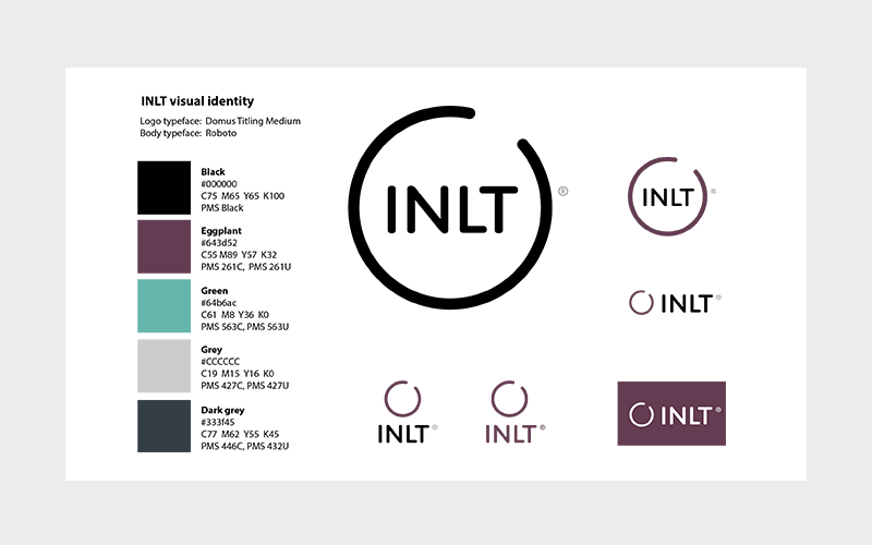
We considered multiple logo concepts before landing on this simple graphic suggesting an "inlet" and the customer's ultimate goal of importing goods into the country:
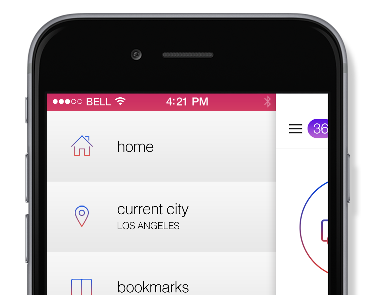
I worked closely with the company founders to review their initial sketches and understand their target customer's goals and then built a workflow and wireframes for approximately 70 screens. I focused on ease of use, clear messaging, and site hierarchy to create an intuitive flow between screens. It was also important to make sure users had a clear sense for what data inputs were being requested on each screen and that they knew where they were in the customs filing process.
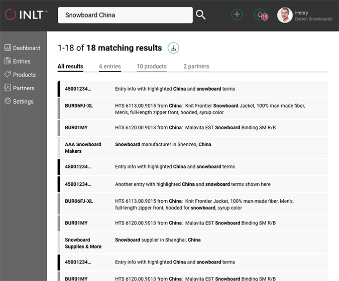
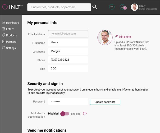
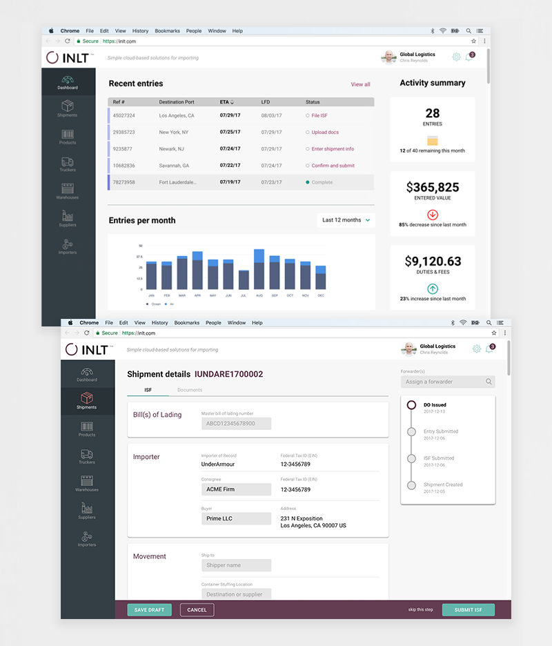
After wireframes were complete and to work most efficiently during the visual design phase, I mocked up just a handful of key screens and sent them along with style specs to the developers as a reference for production. Here are two of those mockups – a dashboard summary and a sample shipment screen:
“Kristen is a branding, UI, and UX savant with a way of working with early-stage businesses that feels both authentic, and structured. I highly recommend engaging with Kristen, be it on day one, a major refresh, or something in between, you won't regret it!” Co-Founder, INLT
Early wireframes like these were used to figure out what words, features, and functionality were needed on each of the 70 screens in the workflow. Placeholder colors, visuals and text formatting were meant only to communicate visual hierarchy within the layout and not the final visual design.